
 تويت
تويت
بدون مقدمات
 Wet Window Text Effect
In this Photoshop tutorial we will create a nice liquid text effect using a free texture found online, a radial gradient, a blending mode change and a few simple layer styles. Posted In Text Effects | Comments 13
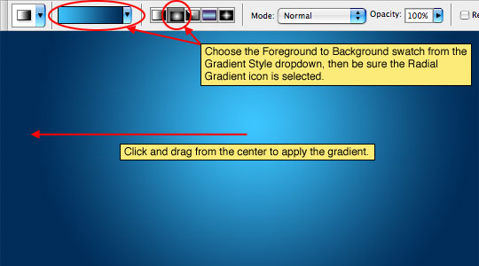
Step 1
Lets start by laying down a nice radial gradient on the "Background" layer. Grab the Gradient tool by pressing the G key, then set the foreground and background swatches to #3bbff8 and #002c59 respectively. Make sure that Foreground to Background is selected in the Gradient style box, and that you’ve chosen the Radial Gradient icon, then click and drag from the center to the edge of the document to apply the gradient.
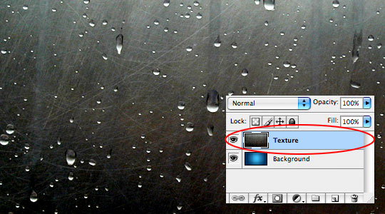
Step 2
Now open the wet texture file you want to use. I got this one for free at Maytag. Click and drag the texture into the working file. This will place the texture on a new layer just above the "Background" layer. Double click the layer name in the Layers palette and rename it "Texture"
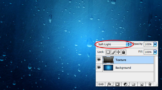
Step 3
Use the Blend Mode drop down menu at the top of the Layers palette to change the layer’s blend mode to Soft Light.
The Soft Light blend mode lightens or darkens the image depending on the color of the top layer: if the top layer’s pixel is dark, then the bottom layer’s pixel is darkened; if the top layer’s pixel is light, then the bottom layer’s pixel is lightened.
Step 4
With the background all set, invoke the Text tool by pressing the T key. If the Character palette isn’t visible, bring it up by choosing Window>Character from the main menu at the top of Photoshop. Click on the stage and type out your text. Once your text is finished, use the Character palette to adjust the font and size until you get something you like. I used a font called Techno at 150pt.
(*note: We’re actually going to make the fill of the text transparent later on, so it doesn’t really matter what color the text is.)

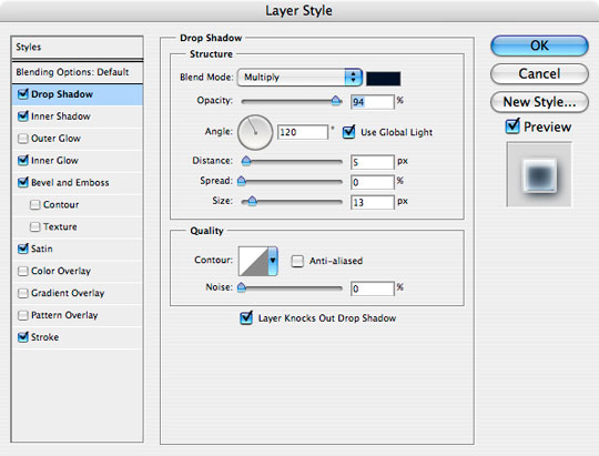
Step 5
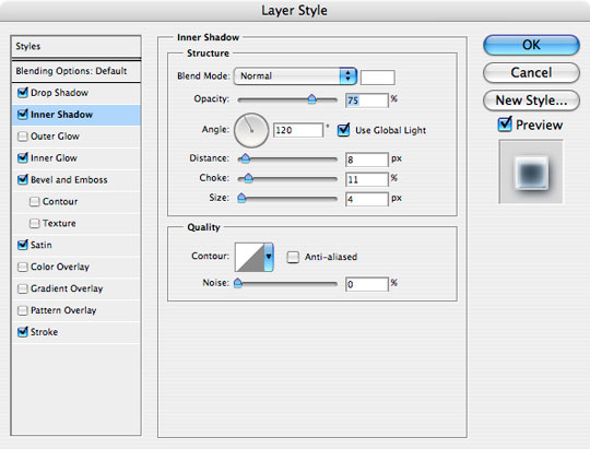
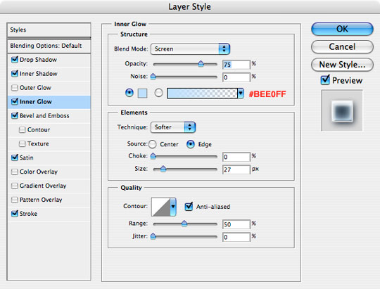
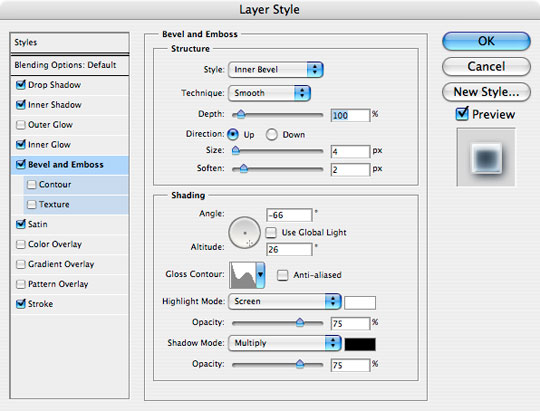
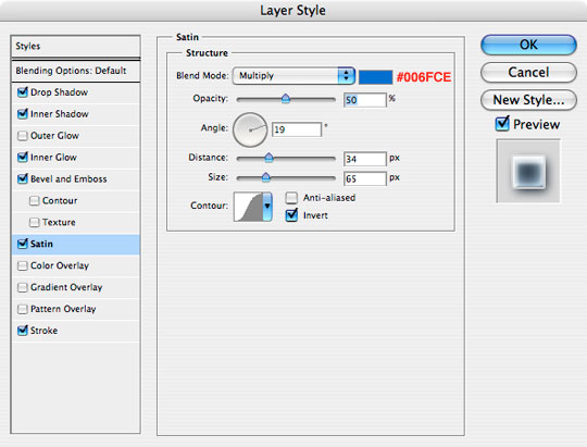
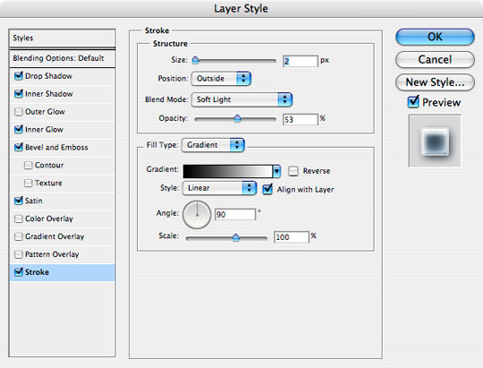
Now add the following Layer Styles to the layer by Right-Clicking (Mac: Command-Clicking) on the text layer and choosing Blending Options, which will bring up the Layer Styles dialog box. When you’ve added all 6 styles click OK.
Step 6
If you got all that correct, your text should look something like this.

Step 7
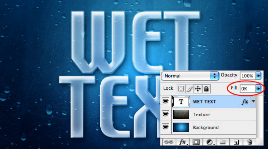
Remember back in step 4 when I said that the color of the text wasn’t important because the actual color would be hidden? … Well lets take care of that now by dropping the layer’s Fill opacity to 0% as shown below.
Step 8
At this point we could call it quits with a nice effect, but lets take this thing one step further and add a little more realism to our text. You’ll need to follow the next few steps very carefully.
Command-Click (PC: Ctrl-Click) on the Text layer’s thumbnail in the Layers palette to load the text as a selection.

Step 9
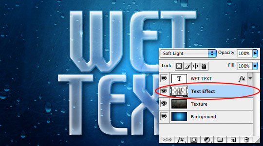
Click on the "Texture" layer in the layers palette (*note: it will now be highlighted) then press Command-J (PC: Ctrl-J) to duplicate only the selected area of the texture layer. This will create a new layer above the "Texture" layer called "Layer 1". Go ahead and double click on the layer’s name and change it to "Text Effect".
Step 10
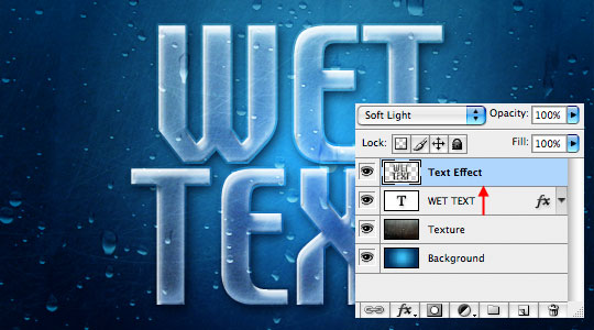
Now click and drag the new "Text Effect" layer to the top of the layers stack.
Step 11
And that’s it folks. Great job!

Wet Window Text Effect In this Photoshop tutorial we will create a nice liquid text effect using a free texture found online, a radial gradient, a blending mode change and a few simple layer styles. Posted In Text Effects | Comments 13
Step 1
Lets start by laying down a nice radial gradient on the "Background" layer. Grab the Gradient tool by pressing the G key, then set the foreground and background swatches to #3bbff8 and #002c59 respectively. Make sure that Foreground to Background is selected in the Gradient style box, and that you’ve chosen the Radial Gradient icon, then click and drag from the center to the edge of the document to apply the gradient.
Step 2
Now open the wet texture file you want to use. I got this one for free at Maytag. Click and drag the texture into the working file. This will place the texture on a new layer just above the "Background" layer. Double click the layer name in the Layers palette and rename it "Texture"
Step 3
Use the Blend Mode drop down menu at the top of the Layers palette to change the layer’s blend mode to Soft Light.
The Soft Light blend mode lightens or darkens the image depending on the color of the top layer: if the top layer’s pixel is dark, then the bottom layer’s pixel is darkened; if the top layer’s pixel is light, then the bottom layer’s pixel is lightened.
Step 4
With the background all set, invoke the Text tool by pressing the T key. If the Character palette isn’t visible, bring it up by choosing Window>Character from the main menu at the top of Photoshop. Click on the stage and type out your text. Once your text is finished, use the Character palette to adjust the font and size until you get something you like. I used a font called Techno at 150pt.
(*note: We’re actually going to make the fill of the text transparent later on, so it doesn’t really matter what color the text is.)
Step 5
Now add the following Layer Styles to the layer by Right-Clicking (Mac: Command-Clicking) on the text layer and choosing Blending Options, which will bring up the Layer Styles dialog box. When you’ve added all 6 styles click OK.
Step 6
If you got all that correct, your text should look something like this.
Step 7
Remember back in step 4 when I said that the color of the text wasn’t important because the actual color would be hidden? … Well lets take care of that now by dropping the layer’s Fill opacity to 0% as shown below.
Step 8
At this point we could call it quits with a nice effect, but lets take this thing one step further and add a little more realism to our text. You’ll need to follow the next few steps very carefully.
Command-Click (PC: Ctrl-Click) on the Text layer’s thumbnail in the Layers palette to load the text as a selection.
Step 9
Click on the "Texture" layer in the layers palette (*note: it will now be highlighted) then press Command-J (PC: Ctrl-J) to duplicate only the selected area of the texture layer. This will create a new layer above the "Texture" layer called "Layer 1". Go ahead and double click on the layer’s name and change it to "Text Effect".
Step 10
Now click and drag the new "Text Effect" layer to the top of the layers stack.
Step 11
And that’s it folks. Great job!
تعليق